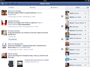
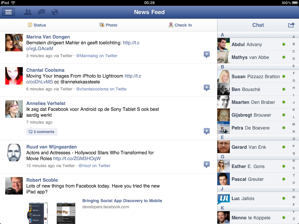
 Today Facebook has finally launched its long awaited iPad app. There were rumors that it was postponed until the Apple iPhone 4S presentation last week, because it would be so wonderful. Well, to put it bluntly, I know why they did not show it. Yes, it is nice, yes it is by Facebook, but no, it is not shocking.
The iPad app has a nice feel to it. You have your continuing news feed taking up about 75% of the screen and then you have the chat option on the side. On the left side of the screen you can pull up a fast menu for navigating through everything Facebook has to offer, including apps. Interestingly, there is no “pages” button in the sidebar. And I doubt Facebook forgot that button. I am wondering what their focus on pages will become in the near future after they have rolled out timeline etc. for every user. Another interesting button is the checkin. Above the news feed you have the option to leave an update, add a photo or to check in. Previously Facebook seemed to loose its interest in check-ins for businesses. So, is this a turn from a course set earlier, or is the button still in because it was there in the initial development? Those are interesting questions.
All in all, the Facebook app is nice. It has a good Facebook feel to it and that makes it easy to use and very familiar. It is easier to navigate and a bit easier to work with, as all the areas are just bigger in comparison to running the site on Safari on the iPad. Bigger fingers will appreciate that. As for me? I just appreciate it as it is a well functioning app for a service I use a lot. However, the iPad app misses the new timeline, the ticker, the selected news stories and pages. And missing out on the four features I use most on Facebook is just too much. So, this is not an app I am going to use.
Let me know what you think. Download the app at: https://www.facebook.com/mobile/ipad


 I love the future. I have loved it ever since I started reading. Technology is shaping our future fast. Back in 1985 I wrote my first computer program. Back in 1994 I launched my first website and I have been working with organizations on integrating new technology ever since.